Beyond the Hamburger: Better Mobile Menu Patterns for Modern Websites
For more than a decade, the hamburger icon has been the default answer to one of responsive design’s biggest challenges: how do you fit a full website navigation into a tiny mobile screen without overwhelming the user? The hamburger icon has become popular because it solves a layout problem, not a usability one.
It’s familiar, it’s compact, and it’s everywhere. But it’s also far from perfect. Hidden navigation slows people down, reduces discoverability, and often forces users into extra taps just to understand what a site offers. Also, the meaning of the hamburger icon is not self-explanatory, and if a person doesn't know that those three stacked lines mean "menu", they might simply not find what they are looking for.
The Nielsen Norman Group have published a great article about the usability of the hamburger menu and recommendations on how to use it today.
As I was researching for this article, I noticed that a lot of sites that used different patterns in the past have now moved to the hamburger menu. Personally, I think that's a shame as the web, again, becomes less diverse and less interesting.
In this article, I would like to dive into alternative patterns for menus and how to choose the right pattern for your website.
1. Priority+ (or “More”) Menu
This pattern is responsive and automatic. It shows as many navigation items as will fit in the available space, and anything that doesn’t fit moves into a “More” menu.
Why it works
- High discoverability: Users see as many items as possible without needing to tap.
- Adaptive: As screens grow, items pop back out; as screens shrink, they tuck away.
- Low cognitive load: Users don’t need to guess what’s important — the layout simply adjusts.
Examples
https://www.smashingmagazine.com/ uses the Priority+ pattern for the main menu, with items collapsing into a 'More 😺' button as space tightens:
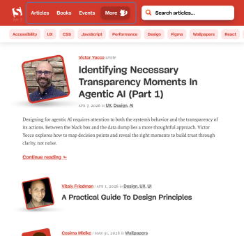
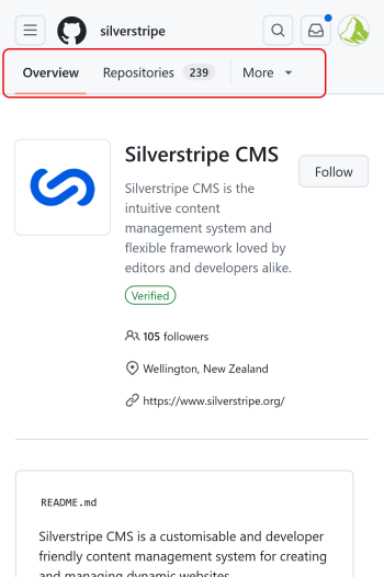
GitHub uses this pattern with a more dropdown-like 'More' button:
Best for
- Sites where all top‑level items matter.
- Navigation that needs to scale gracefully from mobile to desktop.
2. Tab Bar / Dock / Bottom Navigation
Borrowed from mobile apps, this pattern places key navigation items at the bottom of the screen.
Why it works
- Easy thumb reach.
- Clear labels: no guessing what an icon means.
- Encourages exploration because everything is visible.
Examples
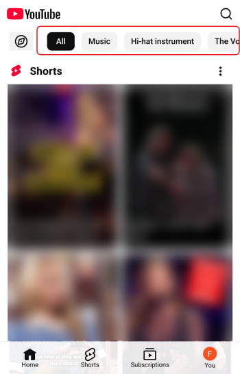
YouTube uses it for the main menu at the bottom:

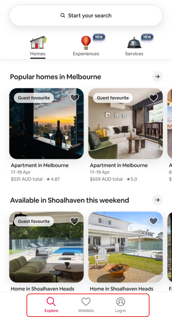
And Airbnb uses this for some of their action items:
Best for
- Sites with 3–5 primary sections or actions
- Content-heavy sites where users move between sections frequently.
3. Inline Navigation With Horizontal Scrolling
A simple row of links that scrolls horizontally on small screens.
Why it works
- Everything is visible at a glance.
- No hidden content.
- Works well with short labels and category‑based sites.
Examples
The AWS documentation site uses an enhanced version of this for its main menu:

And YouTube uses it for their category menu at the top:
Best for
- Blogs, news sites, documentation.
- Sites with many categories but short names.
4. Combo Menu (Visible + Hidden)
This pattern is editorial and intentional. You choose the 2-3 most important links to show, and everything else is always hidden behind a hamburger or “More” button.
This is different to the Priority+ pattern we discussed in section 1. With this Combo Menu, you have 2-3 primary items that are always visible, no matter the screen size (although at some point you'll have to make adjustments eventually). The Priority+ pattern on the other hand always adjusts the visible items to the available space and hides the items that don't fit.
Why it works
- Strong hierarchy: Users immediately see the most important actions.
- Reduced clutter: Great for marketing sites where clarity matters.
- Consistent behaviour: The pattern stays the same across breakpoints.
Examples
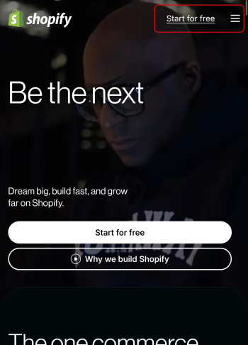
I haven't found an example of this exact pattern. Shopify uses a simplified version of this, keeping the main call to action "Start for free" always visible and hiding the menu behind the hamburger. But in my opinion, the CTA is not really part of the menu, that's why I call this a 'simplified version':
Best for
- Sites with clear primary actions (e.g., “Book”, “Shop”, “Donate”).
- Businesses with long menus but obvious priorities.
Usability Principles to Guide Your Choice
- 1. Keep the most important paths visible:
If a page is essential to conversions, don’t hide it behind an icon. - 2. Reduce cognitive load:
Users shouldn’t have to guess where things are or what an icon means. If you use the hamburger icon, add a visible label to it. - 3. Minimise taps:
Every extra interaction is friction, especially on mobile. - 4. Match the pattern to the content:
Navigation should reflect the site’s structure, not force it into a pattern. - 5. Test on real devices:
A menu that looks elegant in Figma can feel clumsy on a phone.
What About Larger Screens?
As screens get bigger, the hamburger becomes even less efficient. Users expect more visible navigation, not less.
Good patterns for larger screens:
- Sticky top navigation with visible links
- Priority+ menus that expand as space allows
- Hybrid menus that adapt from tabs to inline links
The goal is continuity: users shouldn’t have to relearn the interface as the screen grows.
So... Is the Hamburger Dead?
No, unfortunately not. Even though it might not be the most usable pattern, it has become the quasi-standard for many sites. But it is worth considering other options, especially when:
- The site has a limited number of primary sections or actions
- The audience is not very tech‑savvy or unfamiliar with the icon.
Modern responsive design gives us far better tools to balance clarity, space, and usability.
The real question isn’t “Should we use a hamburger menu?”
It’s “How can we make navigation obvious, effortless, and appropriate for the device?”
When you start from that mindset, the right pattern becomes much clearer.